30 December 2009

San Fernando Valley (V)


Found time to do two more vies of the San Fernando Valley. Sherman Oaks at sunset and a dim light in the Sepulveda Dam, Van Nuys.
Typical winter weather in Los Angeles, my favorite season here for sure. While the rest of the country is wrapped in storms, this weather makes you want to cry it's so beautiful.

San Fernando Valley (IV)


As we finish this 2009 year, I also finish my series on the San Fernando Valley urban scenes slated to be exhibited in La Galeria Gitana this January 2010.
I have read a lot about Vermeer, the dutch master of the seventeenth century . When one thinks "plein air", nobody seems more removed from it than Vermeer. And yet, his solutions and focus could be as valid for a methodical painter , like he was, as for a guerrilla plein air painter armed with a Toyota Prius, aluminum color tubes and a rich palette.

It is winter in Los Angeles and light is fleeting. No snow scenes at hand unless one takes to the mountains. And yet it is brighter outside than in Holland most of the year. Vermeer captured the northern light masterfully. He also captured domestic scenes and simple moments only to bring them to monumental beauty . As I painted these rooftops over Burbank, I kept his "View of Delft" in my mind. Sure, the difference is abysmal, but I wasn't afraid of the passing clouds and muted tones any more. The red trees added accents, the roof workers a little narrative...Cheers to Vermeer and many more discoveries in the new year.

08 December 2009

The issue of large scale.

So I've finally taken the plunge and did my first large scale painting, 36"x24". That is pretty large for a guy like me used to do little 8"x10" plain air pieces. I am not entirely happy with it and I am anxious to try it again. But a lot of unexpected challenges came simply from the painting's size. This are some lessons I hope I learnt:

1) A previous study can save a lot of time and pain. In fact, it helps if the study is not just a try-out but a real blueprint in scale, color and mood. I did a study but then changes the ratio in the painting with the result that I had to address perspective issues very soon. The dog, for example, had to be repainted closer to the girl in order to avoid making it look like a chihuahua.

This was the study.

2) Drawing and perspective problems will be more acute by the fact that we need to encompass more surface. Pull back often and follow your study with care. I now have a deeper appreciation of the careful underpainting old masters used to build a canvas.

3) Using larger brushes and more paint is not just an obvious choice for larger scale paintings. If we desire to maintain a certain "freshness" of stroke , we should treat the surface with the precision and textural interest of a smaller piece, not hiding mediocre brushwork in the large area or getting lost in parcels of messy work.

4) In small alla prima paintings, color harmony is almost guaranteed since the palette we use to start is the same as the one we finish with. Not so with a large painting, it behooves me to "plan" the palette carefully.

5) A schedule of work is very useful to hammer out a larger piece. Since it is painted in stages, it is essential to maintain a rhythm.

So this is my final piece. I see so much room for improvement I am almost giddy with impatience to put this lessons to work in my next painting.

22 November 2009

Demo Number Two


Last Thursday I did a demo at the San Gabriel Fine Arts Association to a small but very receptive group of members. I was a tad nervous after a long drive from Marina del Rey but I think things went swimmingly. I decided to paint an airplane from a picture I took at the Burbank airport with the intention of not only explaining whatever techniques I thought of but also trying to convey that a painting can be lurking anywhere, even in a seemingly sterile environment like Los Angeles.
My main emphasis painting the piece was the idea of a verbalized "concept" or main idea before starting. Also the avoidance of errors of color, drawing (including perspective) and tonal value while in pursuit of the idea. And finally a few notes of reflections and edges as defining of shapes rather than lines and detail.

Thank you Alice Lee and all the organizers for a nice evening of fun.

19 October 2009

Ribbons, ribbons


After all the October events and having a bit more time in my hands due to vacation, I started reconsidering my painting direction. Armando makes me reconsider it *every day* but that is another story :). When I get in this kind of "funk", I find it useful to go stroll in a museum or a good exhibit to stay enthusiastic and even though I have no ego problems, humble and conscious of the way ahead. I also find it helpful to enter smaller events and socialize with artists and people interested in art.

So

a) I visited the Laguna Plein Air 2009 event and let my jaw drop in front of the Ray Roberts, Calvin Liang, Jennifer McChristian, Greg La Rock, Ken De Waard , Bryan Scott Taylor and J. Budicin masterpieces among others. I also took a peek through the "Pasadena, City of Trees" organized by the California Art Club.

b) I entered some paintings in the San Gabriel Fine Arts Fall show -that is where I got the ribbons in the pictures- as well as the Craftsman Weekend in Pasadena where my gallery Jose Vera had a booth. I also entered the miniature show at the Segil gallery which afforded me the opportunity to talk with Jason Situ and Laura Segil for a while.


Here are Tania Verafiled and myself at the Masonic Temple in Old Pasadena during the Craftsman weekend. My paintings separate us, figuratively speaking.


So many questions bubbling in my head. One is the matter of size. Painting bigger and not in just one session as I usually do. I am not a subscriber of bigger is better but it would be interesting to see a painting through in a larger scale. The other is the question of the physical studio. Part of the reason I don't tackle certain projects is a lack of appropriate space. I need to work on a solution and quickly. And of course the question of "quality". That I don't expect to ever solve.... fortunately.

05 October 2009

SLO Quick Draw


This is the part of the week when all participating artists paint a 2 hour piece around the Mission Plaza. My painting reached a high price so needless to say I was elated. (Thanks Ray and Elaine!) Here are two pics of the painting and the auction.

San Luis Obispo 2009

I just came back from San Luis Obispo Plen Air 2009. This event gets better and better every year. The selection of artists was amazing. The main benefit any artist can obtain from entering this events is beyond monetary. Sales this year were a little slow and that can damage the validation necessary to "keep at it" for sure. I sold four paintings so I can't really complain.
The main benefit comes from knowing some wonderful people and learning from all. I was lucky to room with Ken DeWaard. This master from Wisconsin is talented beyond words and has a natural ability to tackle big formats with dynamic brushtrokes and a very solid concept. Check out his website.
Some pics form the event. Here are Greg La Rock, Ken De Waard and Mike Rada, three masters I was lucky to meet. Catch them at Laguna Beach next weekend!
A view from the gallery in the Art Center. The paintings in the front are Scott Lloyd Anderson's.And here are Ed Terpening and Chuck Kovacic in front of Ed's paintings.

Here my corner of the gallery....all these are sold!

26 September 2009

vendedor de paletas


Adding people to your paintings definitely makes them more narrative. I was painting in Hollenbeck part in East Los Angeles. A whole school of children was leaving school soon after I settled. Between comments like "Not bad" and "That's rad"(really?), most of the kids were fascinated by the fact that I added a "vendedor de paletas" in the background, a popsicle salesman. One kid paused for a bit and blurted "So how do you do it?" I immediately recognized a certain urgency I used to have regarding painting (I still do) so I put down the brushes for a minute and gave him some hints: can you see how things far away look more and more like the sky color? what color are the tree trunks, really? (very confused look after I said they are not really that brown and compared them to his shoes). If you mix yellow and blue, what do you get? When he started to show signs of saturation I felt my job was done. It is work kid. Forever. But it is fun work.

San Fernando (III)


Endured the blustery Santa Ana's in the San Fernando Valley last weekend. A girl came out of the shop behind where I was painting and said. "Do you mind me asking *why* are you painting ?" Good question. I mumbled something unconvincing. She looked around and said "Oh, You are painting suburbia." I thought, well yes, I guess I am painting "suburbia". I figured she must have wanted to sound educated or something ....only later I noticed the name of the gown shop I was painting: Suburbia. A poem in pink, chiffon and fluorescent lighting.

25 September 2009

Some paintings from North Tahoe.


This was my favorite painting, a small lagoon around Donner Lake. I liked the abstraction of the water reflections and the row of trunks in the back as a lattice of sorts.
The second one was my last painting (currently at Backstreet Gallery in Truckee) , I painted it in an almost impossibly beautiful spot by the Truckee river.

17 September 2009

North Tahoe Plein Air 2009


I traveled to lake Tahoe last week not quite knowing what to expect for North Tahoe Plein Air 2009 , an event organized by Lois Skaff and the North Tahoe Art Center. The ten hour drive from L.A. was pretty intense but the landscapes that greeted me were worth it. It is no wonder this area has become a popular tourist destination, some would argue too popular. It is simply gorgeous with its turquoise lakes, dramatic light shifts and layers of forest.


We had three days to paint and even though I spent a substantial amount of time exploring and hiking, I managed to come up with enough paintings for the festival (7). Most importantly, I made some new friends and met some great artists. I sold four paintings total. Celia Howe of Backstreet Gallery in Truckee even asked me to keep some of the pieces in consignment. Celia and business partner Peggy have a wonderful gallery and framing store in Truckee.


The main show was part of the Northstar wine and food festival. During our show, artists Paul Kratter and Craig Mitchell (judges along with Zeze Mott) did some demonstrations. It was interesting to see how two artists approach a landscape in such different ways, with Paul in a more direct traditional way and Craig with a more illustration approach, that is with a more extensive palette and graphic concept. Here are some pictures of the demonstrations . Guess who is who in these pics from my sparse description....
Clue: Craig is standing in front of Andrew Bolam's gallery in Northstar and Paul has a crowd of devotees around him. :)

07 August 2009

Estes Park, cancelled. :(

Due to unforeseen circumstances, I had to cancel my long awaited Estes Park trip. I was really looking forward to it. The urgent keeps getting in the way of the important.

20 July 2009

13 July 2009

San Fernando Valley (III)


Painted in the San Fernando Mission. One of the most (surprisingly) well kept mission buildings I've seen. It was a really hot day but the painting turned out well despite the fact that most interesting light occurs in the evening and early hours of the day in my opinion. I was there at about noon.

Later on, I moved to Pasadena where I tried a quick sketch overlooking the Rose Bowl . After all, I need a painting for the Pasadena Art Walk in October. ....and quite by chance I met Elaine Adams from the California Art Club ! Just as I was talking about the California Art Club to a couple that stopped by. Now what are the chances? The couple commented on the view. They might even might commission a large piece of the San Gabriel mountains. I'll keep my fingers crossed. Another couple had a picnic overlooking the area as well.

I need to get to those mountains.

26 June 2009

Old Mill reception.


So here is Armando partaking in the cheese and crackers at the Old Mill California Art Club reception in San Marino, CA.

23 June 2009

Sean Cheetham Workshop. Day 2


During the second day of the workshop. Sean entered into some detail about his supports and his approach to alla prima painting. His "pieces de resistance" use wood as a support. He uses MDO wood or some panels form a provider which already come framed in the back to avoid bending.

1) He then applies an acrylic sealant that he lets cure for at least a week.

2) He applies several layers of gesso allowing drying between them and some texture to occur. No sanding. Chemicals from acrylic materials easily get in the air and can be dangerous.

3) The last step pictured here is using a big trowel to smooth a last layer of molding paste which gives the surface very smooth but absorbent.

The process takes minutes in every layer but it takes two to three weeks to complete as the layers have to dry and cure completely.

He then uses graphite rubbed on a paper to transfer the drawing onto the board. The graphite in this stage is loose so he will wash it very lightly with acrylic paints. he will recreate the whole painting using acrylics almost as if they were watercolors in very very transparent layers but with accurate local colors.


We then moved on to the "interactive" part of his demonstration. Painting from a live model he demonstrated that even in a larger format, the same principles can be applied. He used a Fredrix support with Belgian linen onto which he applied a wash mostly consistent of Burnt Siena. He then established as tight a drawing with his brushes as one could hope for and moved onto the darker areas of the subject with a mix of burnt Siena, Alizarin and Olive green.Right after this stage, he mixed his fluorescent light Manganese Blue+ White mix (something ,by the way, that also Jeremy Lipking is fond of doing) and his "main" tone. From then on, he systematically built the face form the darker to the lighter areas with some balancing in between. The result was "sorollesque" and loose. Never or very rarely did he go over trodden territory. I won't post my attempt at the same subject because I made a mess of it.

22 June 2009

Sean Cheetham Workshop. Day 1 (b)


For an excellent review on Sean's workshops click on this link and do not miss the graphic of his palette. This are some common weaknesses he points out:


*Starting to paint without a tight and accurate drawing. Impatience costs in time and it doesn't improve spontaneity.

* Starting with powerful darks maintains the luminosity of the shadows and allows the painter to not have to revisit them later and making them muddy.

*Transitions between light and shadow are more subtle than novice painters make them.

*An organized palette saves most of the guesswork as the painting progresses.

* Regular painting helps the artist remember and consolidate what he/she learns.


After Sean had placed all the dark areas with a rich mix of burnt siena and olive green, he made a large pool of mid-tone color and a smaller pool of fluorescent or cool light with manganese blue and white. He then carefully proceeded to add the mid tones. I think this might be one of the most critical parts as it forces to distinguish what is in light and what is receding. Depending of the degree to which each area is exposed to light, cooler or warmer tones will be used. Into consideration as well is the reflection of the background, clothes, etc. ..


Finally, Sean tackled the most luminous areas never for a second jumping to highlights or touches of "effect" which are so frequent in other painters which shall remain unnamed. For a more realistic effect, he used some of the more worn out brushes to blend the paint a bit afterwards loosening the almost graphic effect of the result. This sobriety and uncompromising approach is what makes Sean's paintings so appealing and contemporary as well as the subject matter which shuns the precious and picturesque. You just can't beat reality.


21 June 2009

Sean Cheetham Workshop . Day 1 (a)


I decided to take this workshop an hour before it was about to begin. Kind of in the "spur of the moment". Sean Cheetham is an artist I've admired for a while even though his style is quite different to mine. He paints in a realistic fashion with a very high emphasis on the drawing. His main influences are Michael Hussar and Antonio Lopez among living artists and anywhere from Holbein, Alma-Tadema, Waterhouse, Dagnan-Bouvert, etc... among old masters.

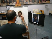
During the first day, he decided to paint a portrait of a sculptor friend in the manner that he usually approaches most of his "finished" work. He brought several non-glossy prints and a support which he had previously primed and already had the drawing of the subject. His palette is not unusual but there a couple of more "acid" colors that seem to go well with his subject matter and lighting of choice.

Cadmium red
Cadmium Green light
Burnt Siena
Scarlet lake
Yellow Ocher Pale
Indian yellow (transp.)
Titanium White
Manganese Blue (semi-transp.)
Cobalt Blue
Windsor Violet
Alizarin Crimson Permanent
Olive Green (dark, from W&N)
Burnt Umber
Ultramarine Blue

and a warm Grey from Rembrandt to neutralize.


He goes over the whole painting first with a light wash of acrylic. Very light so as not to create a layer of plastic between the oil and the support. He usually starts laying the darks first, very precisely and deliberately. He uses cheap University W&N nylon brushes of sizes 4 to 6 which tend not to last but fare well in the level of precision he requires. No big brushes here. He works with a tremendous amount of detail and focus. No rushing here. That's how you go quickly actually, by not making mistakes or adding random garbage.

Here is a picture of the painting after all the darks have been placed.

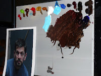
And here is a picture of the original print. Sean says he prefers to work directly from the monitor to judge color and is not against any technique to accomplish accuracy. Of course, he draws *really* well.


It is worth observing how organized he is in his palette construction. During the dark building process he mixes enough of a pool of dark. he also mixes the tone of the fluorescent lighting with manganese blue for posterior use. Like any good painter, his colors will remain almost miraculously clean throughout.

20 June 2009

San Fernando Valley (II)


As I explore the San Fernando valley I came across the Hansen Dam , an elegant structure in the middle of what the L.A. River might have looked like at some point in History. I explored the area around the Equestrian Center and came home reeking of manure. But it was worth it. No horses in the paintings but I took photos for future reference.

07 June 2009

Amazing skies


We rarely see clouds here in LA . However, during the California Art Club paint-out at Griffith Park 06/06/09 , the sky was like a battlefield of beautiful, rolling and massive cumuli. I was so excited I *had" to borrow a bigger canvas from my friend Rod Smith least I was imprisoned in my usual 9x12. I did two paintings that day, I felt I couldn't let these storm beauties pass by unaknowledged.

28 May 2009

The San Fernando Valley


With my views set on a future exhibition I've started exploring the San Fernando valley. Here is my fist piece done while randomly driving away from Encino. Balboa Park has a lot of picnicing people and willing albeit impatient models...like ducks.