18 December 2010

Some exciting commissions

This month I've been tremendously busy with commissions. Most of them have been a chance to meet wonderful people. It is a strange rapport when someone gives you an art commission. On one hand you want to please them of course, on the other hand they have to be " open" enough or agree with your view, your level of achievable detail, etc....

In no other subject I've received more categorical advice from fellow artists. Some favor payment beforehand, payment for every sketch previous to the final piece, a staged plan, etc... I am lucky that I do not make my living from art just yet so I am very loose when it comes to commitment, basically, "you don't like it, you don't have to buy it " is my rule. And "liking" it is impossible to predict , unlike, say, plumbing. Naturally, if it was a hefty commission as far as the work involved I might have to add some safeguards. Most importantly, the client must have seen something in your style that he/she likes.

I painted this view of a Baltimore street using Google Earth. The client asked for the addition of certain details like the specific cars seen here. It is not the first piece of art I see using Google by the way.

This other piece was painted on location, the house of the client. He liked the view of downtown Los Angeles from the porch, and it was quite a view. He only asked for some minor adjustment to the sky color after he saw the final piece.

25 November 2010

Arroyo Arts Collective Artwalk 2010

Bellow, "Shakespeare Bridge" 9"x12". A lot of folks had stories about discovering, living or experiencing an aspect of this Silverlake landmark. I usually paint things that interest me formally, color or design-wise. But most people really find an emotional connection with the "content" of the painting , there is no fighting that.


I think this is the sixth year I participate in the Arroyo Arts Collective Artwalk in Highland Park. Eight painters from the Mt Washington group were exhibiting at the Ziegler Estate house. We were a popular stop in the tour and made some sales. Here are some (not too good) pictures of my artwork and the event in general. Above, "Fair Oaks Cafe, Pasadena", an 11"x14" piece.

A crowd pleaser above: "Mt. Angelus ".

Below, "The Silver Platter" a dive bar in Korea Town with the Bullocks,Macys tower in the background (Today Southwest School of Law).

Bellow Chris Zambon's lovely set-up in the lobby of the Ziegler's house.


14 November 2010

California Art Club Mian Situ's Demo.

I attended 
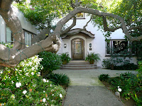
Mian Situ's demo organized by the California Art Club at the historic Blinn House in Pasadena. It was a real treat. But can I say how much it annoys me when people use the intermission to plant themselves in front of the canvas-in-progress? I mean, taking a picture or two is expected but just chit-chat and ignore the crowds behind you is kind of rude and won't make you paint better. There , I let that out. Needless to say, attendance was high.


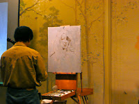
The model was Barbara Chung, part of the California Art Club team. Video services provided by Karen and Glenn Winters which makes me think there will be an available DVD in the future. Mian Situ was extremely sweet and funny during the whole thing. His palette consisted of the usual suspects but his array of earth colors was a bit wider than usual.

-Titanium white
-Cadmium Yellow
-Cadmium Red
-Alizarin Crimson
-Yellow Ochre
-Burnt Sienna
-Terra Rossa
-Ultramarine Blue
-Cerulean Blue
-Sap Green (even though his green today was more like a light green)


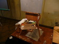
His smaller brushes were of the mongoose Rosemary brand name. The bigger ones were bristle and his brand of choice varies.
His canvas was a regular acrylic primed canvas primed with a bit of grey.
He normally will paint without primer and take his time to build up the layers but, for the demo, he needed something ready made.
His medium is none, he thinks paints have enough oil to be handled without.

Mian started with some deliberate markings. Very soon, the likeness of the model was dead-on. Mian applied the painting blocking first the biggest masses and broader areas. His brushwork is very interesting to watch. He doesn't hesitate to use paper towels,knife, fingers and all kinds of brush application techniques to keep it moving.


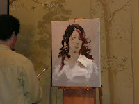
He created the hair and shirt masses first. The lighter and darker areas first I suppose. He blocked the color quickly and loosely. He pointed out is is not that important to try for accuracy in the actual color but rather to pick whichever one feels right and make it work inside the canvas. The way he created soft and hard edges was like magic, really. trying to explain it is like trying to explain music. One thing that stood out is how his work was extremely accurate and , like I said, deliberate. It seems that he had a plan for every stroke as he would go back on certain areas after every once in a while and just apply that softness or accent that made it all work.


Once the cleaner colors were applied, Mian felt very comfortable mixing nuanced tones to connect and enhance the areas. The nose bridge , the sap green and burnt sienna mix in neck and shadow area were applied soon and remained the "big notes' in the actual face. The lips' tones came soon thereafter and a few of the chiseling features . Everything else was done in more muted notes and brush sculpting.


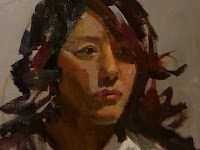
This painting bellow is the result of exactly one hour and twenty minutes of work. Pretty amazing if you ask me.
And the model's likeness is just incredible. He admits it might take days for him to finish a figure in his studio but what does this man consider finished? Mian is kind of famous for his beautiful "historical" or "narrative" pieces. He researches these quite a bit and sometimes they feel a bit distant. he uses photographs as reference as well. So it was really nice to see him paint "alla prima"


13 November 2010

Downtown painting with Alex Schaefer


I've always admired Alex's Schaefer bold and wonderful artwork. I tell him that if I had money and a house I would just buy his pieces and Jennifer McChristian's. I just love both these artists a lot and I am lucky to know them both personally. So I called him up to see if we could go downtown and paint for a bit. He knew of some new park with wonderful views of the downtown skyline so there we went. The weather was great and Alex made such a beautiful and LARGE painting .


The skyline is deceivingly complex and it requires either great simplification of shapes or -if taking a more detailed approach- a lot of attention to color nuance, edges and texture.
Alex is always generous and open about his methods. His style is very free flowing. I loved the answer he gave to one young admirer. Young Admirer :"How long did it take you to paint this?" Alex: "We got here at one, so ...three hour and twenty years." I am adopting that answer.


He alternates between acrylics and oils. he painted with oils and a mixture of galkyd and gamsol as medium which made the paint somewhat workable when using wet on wet. And that's it, the rest is his awesome sense of color, design and color, really.

As a cap to our afternoon, I drove Alex around to one of my favorite spots in hopes we will be able to paint there sometime soon.

01 October 2010

"Believeing in Seeing" by Bonnie Young.

Bonnie Young is the poet laureate that "shadowed" me last Monday while I was painting as part of the San Luis Obispo Plein Air 2010 event.
We drove around a bit in her town of Arroyo Grande in the insane heat and picked a spot close to a park where we could get under the shade. But alas, the only scenery was the back shack of Ira's Bike Shop. So that is what I painted.
The car in the painting is Bonnie's. She actually placed it there when the one I was painting left. This is my painting and the poem she read at the Poetry Reading . "Plein Air Poetry". I like that she called me the "Houdini of Color" , wouza.


"Believing is seeing"
"People forget how to paint when they begin learning - they paint what they know, not what they see" -Jose L. De Juan

Ignoring pink berries, reddish fruit
of Strawberry trees and their peeling
red-wine bark, the artist sets
his easel toward Ira's Bike Shop.
A ramshackle one-story structure
backed by tall uneven buildings,
all built in early nineteen-hundred.
Hot sun glazes old brick and block walls,
dark red and watery blue paint curling.
What secrets will he reveal?

With umbrella hoisted, brimmed hat
aslant, he quickly sketches his scene.
He splashes yellow on lower
canvas, orange across the skyline,
nothing I can see before me.
Windows begin to open, browns
and blues entering. Unlike early
builders and masons, he creates
a miniature of today, transporting
us back and forth one-hundred years.

A Houidini of color, he swirls
all that yellow into warm beige
of Ira's walls, vivid blue trash
barrel, sunlight glinting off a parked car
as the persistence of light suffuses.
A bike rides in, but that car's exit
frustrates the painter vision
until a new car arrives to reflect.
Light stroking color becomes the god,
speaking to the artist soul.

Now sky's blue is jazzing with bright
orange ripples inviting the ages
to trade wheels, deliver mail, try
a taco, whistle a tune,
look around and sink into seeing.

-Bonnie Young

18 September 2010

Some small pieces from Mt Washington.

Sometimes one only has a couple of hours to paint. This is a great chance to exercise simplification and try a small piece with the biggest brushes you can find. These two pieces are from Mt. Washington.

12 September 2010

California Art Club Paint Out South Pasadena


This painting was done last Saturday during the California Art Club paint-out in South Pasadena. I drove around for a bit and saw this fabulous hydrangeas...and the orange cat in the sun. Of course tabby was long gone by the time I got to paint but i tried committing him to my memory. Almost every neighbor in Filmore St. came out to see the painting except the owner of the house.

After the accident.


I had a bad accident in my left hand that required tendon surgery. My father recently had another brush with bad news of the medical kind. Our reaction was the same : My father painted everyday this summer in his beloved Euskadi. As soon as my cast was off I launched with more urgency into painting. Nothing else seems to matter. Not my search for a new house (which must have a studio of some sort), nor whether I ever become famous or wealthy as long as I can pay for paints, not negative relationships or even distractions regarding whether I am a good enough painter or even questions off faith and self-value.

Renoir had to have his brushes tied to his hand so he could paint due to his rheumatism. I am a fan of that even if I don't like Renoir.

I started painting in a quite unexplored area of Los Angeles pictorically. About 80 years ago, Wilshire Blvd. encompassed everything that was happening and it was a glistening Art Deco mecca. Today it is a third Korea Town, a third salvadorean ghetto and a third everything else. The mixture makes for some interesting "canyons" that produce surreal landscapes at sunset or when it rains.

14 July 2010

Calvin Liang's workshop. Day 3.


The "Overseas Painter from China" a.k.a Calvin Liang performed a looser demo today at Heisler Park in Laguna Beach. By the way, that "overseas" alias is the title of his published monography . A book worth having for sure but whose title is either badly translated or claims Calvin as a Chinese national a little too strongly or both. Was Picasso the "Overseas painter from Spain" ? or Chagall, the "Overseas painter from Russia?"...but I digress.

Besides hammering down "form, color, value and edges" today Calvin had an inspired moment. Pointing to the tip of his brush he said all four elements are contained in every brush stroke. Aha! So every brushstroke counts. I also realized today that what he means by "detail" is not what us westerners would consider as such per se, that is busy work, branches an pebbles. Rather, it is the just as precise and just as deliberate blending and enhancing of the initial masses.
Different today was the palette as well. Just because he demonstrated how he keeps three premixed piles of color, one cool, one warm (made of whatever is left he said) and a neutral grey one. Calvin winces when I say my colors are dirty. He believes it's all in the greys anyway. He also demonstrated the use of black ....in the sky nonetheless.

The use of covering a canvas quickly has become very apparent to me as light kept changing and shadows moving in the cliffs. I post here a bit of my evolution throughout the workshop in the shape of my three pieces. The first one looks quite tentative and confused, the second one of Crystal Cove looks a bit dirty but the basic methods are there, specially in my "Calvin cloud" in the upper corner right ha ha. My third piece -and may be- my most accomplished at this stage- took a lot less time and paint because I finally slowed down enough to become quicker, that is, less mistakes make a faster painting. Even Calvin liked it. He had some awesome suggestions I'll keep to myself.

I really focused on the "form" part today . And it made quite a difference When you think "form", and design, things start to slow down. You want to create forms in the most organic way possible, no parallel strokes or repetitive moves.

And that's that.

13 July 2010

Calvin Liang's workshop Day 2.


Oh look! Our dehydrated and roguish group!


Day 2 of Calvin Liang's workshop took place in Crystal Cove State Park. Calvin set up for a morning view of the cliffs below: Calvin used his "cover the canvas" approach again but he was a lot more detailed than during day one. He traced his usual charcoal design. He carefuly laid the pigment being quite accurate in his color and shape choices. He didn't leave so much detail for the end as in his first piece. Again, he started with the darkest darks, the fence climbing up the left in this case.
But for me it was all about the edges. One thing I noticed is how cleanly Calvin applies the painting and chisels his edges. He was deliberate and very careful. One would expect a slow process and yet, his painting was done in no time, no messing around, no mistakes.

Some quotes from Calvin (in my own words): 1) When you apply a color, do not look at the area you are painting, rather look at any other area. You are constantly comparing and looking for how color compares, not what color it is.
2) It is good to cover the detail in a sort of clockwise move, going from one area to the next and then coming back, it's difficult to make decisions without knowing what's around the corner.
3) Top of the sky is cooler. Bottom is warmer. But we knew this , righ?4) Again, form, color (and color temperature), tone and EDGES. Here is a slightly more colorful puddle. This is -all_ the color Calvin used in his 1 hr, 30 mins painting which is shown at the bottom.

12 July 2010

Calvin Liang workshop Day 1

Thanks to the Laguna Plein Air Association, I received a scolarship to take a workshop of my choice. So who happened to be teaching close-by but the master Calvin Liang. I've always admired his rich luscious masterpieces so I took (even more) time from work and took myself to Newport Beach.
- I will try to synthesize some basic points of his amazing demo.
-For starters, Calvin doesn't use expensive or sophisticated materials for his plein air work. His setup feels comfortable like a pair of old slippers. It's what he is used to. There is a message here, it's not the materials that make the painting. His palette is limited outside, but in the studio he confesses to using a wide palette of up to 23 pigments.I took a picture of his setup and his palette for reference. Nothing fancy. However, Calvin was adamant about one necessary ingredient: "You can't start a painting without a clear design." A concept if you will. It is good practice to have a design in mind before even touching a brush. Then comes the question of form, color, tone and edges. The only things that can go wrong are those four components and any error can be traced to them . "The only trick is no trick" he answered when queried about that deadly question people always ask.... what color is that?. ... A color is the result of the colors around it and there is definitely no recipe. Calvin basically used the same puddle of color for the whole demo hat took aprox. 1 hr an 30 mins.


Calvin showed us his color wheels, some fine examples of his design work and examples of his oeuvre in books and magazines. But soon it was canvas time. First he did a soft charcoal design to be certain of where the elements of the design would be. After the drawing, he applied some dark shapes outlining some foreground boats and deep darks. But he had no hesitation moving on to a thick paste for the rest of the canvas. No liquin or turpentine. Lying the shapes thickly as if applying tile. The goal is to cover up the canvas and create unity.


Calvin never looks at "things", just shapes. And he creates the shapes with an incredible lack of detail initially. He believes, and I agree, that the detail practically paints itself once the main shapes are laid out. In this demo, there were two clear phases. An initial phase when he just lays and covers color to achieve unity. The brushwork has bravado and variety. No reviewing or massaging colors around. Barely a paralel brushtroke.

The second phase is methodical and "fun" according to Calvin. One segment at a time, detail is added. But detail is not a reason to look at things "in detail" . Detail now will be kept together by the fact that the whole canvas is thickly covered. Mind you, some of the canvas peeks through in places.One thing Calvin avoids like the plague is the creation of lines or edges by tracing them with the brush. When he needs to paint an edge, he kisses with paint and "overshoots" the color. Then , with the background color, he picks up the edge and creates a very distinct and clean edge where the one layer of paint overlays another in the right places.


I have to say Calvin is incredibly deliberate and quick because mistakes are few and far between. When he makes one, he mixes back the color, and covers it up to redo the area until he is happy. No matter how many times. It's a "schoolboy" approach that I find attractive since it is common to believe everything we put down is precious.