29 May 2010

Tony Pro's Demo Part 2. Methodology.


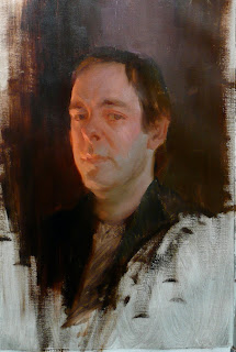
Tony Pro's style is lush, rich and rooted in classical tradition and many influences (as it should be). He is a master of "alla prima" and his demo was in that style.

The basis of his method during the workshop was to start with the average of the main blocks of color and work towards the lights and darks. His canvas was primed in a neutral grey.

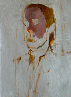
A preliminary drawing is necessary. Through comparative measurement and shape relatedness, the basic angles and key lines are rendered, a map of the main features.


The likeness of a model, says Tony, really hinges 85% on the triangle formed by the eyes and the nose tip. How far, big or wide the eyes are with respect to the nose. The way this triangle rests on the remaining head structure determines 15% of the recognition of a character. Of course this is just theoretical but hints at where likeness can derail easily.


Once the preliminary drawing is enough to map the features of the model, we proceed to block the main areas of color with a careful assessment of the light temperature and how its relative tone and chroma might affect the final result.

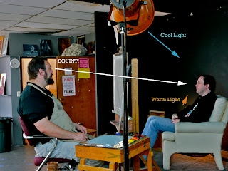
Squinting provides the necessary abstraction of shape and color to start blocking in the shapes. The main planes of the head are covered paying special attention at the tone and color. No hurrying here, no fireworks, the foundation of the whole portrait needs to be solid.

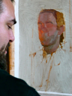
As reference, Tony pointed to Assaro's head to get some clues as to where the primary planes fall. Observe how he just blocked in the eyes as reddish shadows, and the cylinder containing the muzzle as a basic shape, no lips or eyelashes . We will "sneak in" into these details at a later stage, when we are sure the main and secondary planes are properly featured.
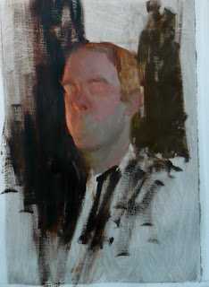


The main areas of color, including the background needs to be placed to get an accurate idea of the relative value of all colors. For example, the model's pale skin looked dark until it was compared to the deeper blacks of the background. Ditto for the color temperature on both sides of the face.

Most areas will remain simple, most of the modeling and work will occur where the warm light meets the edge of the cool area.

No mysteries here, no magic brush, the modeling and chiseling of the face proceeds in the same manner, always looking for the simplest shapes. No hesitation to wipe them out and revert to simplicity when things get out of hand.

It is easy to get "muddy" in a hurry by overworking details and adding information that adds nothing. That is why it helps to have the main areas "solved" before moving on. You get the idea. Down here I post the final or almost done result.






28 May 2010

Tony Pro's workshop Part 1. Set up.


So I *finally* had a chance to take a workshop with the Tony Pro. I've been trying to take it for years, quite literally. Something always got in the way. I think Pro is one of those awesome painters we are lucky to have around giving classes for which one doesn't have to take out a bank loan to attend.
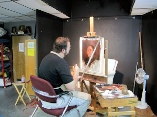
I wasn't disappointed. Tony did a demo of his friend Martin. He captured the character masterfully. There is no replacing attending a workshop but -as I did for my workshop with Sean Cheetham, http://josedejuan.blogspot.com/2009/06/sean-cheetham-workshop-day-3.html I will post some highlights.

Tony teaches with the limited Zorn palette but for demo's he likes to have all the weaponry, including a couple of pre-mixed colors for lighting cool areas and warm areas :Radiant Blue and Naples Yellow. Here is a picture of his palette.


He uses a variety of transparent colors including transparent red oxide, ultramarine blue , alizarin crimson permanent and viridian. Alizarin is considered too tinting to use for under-drawing so Tony -for this demo- used a mix of viridian and red oxide. Venetian red also has a powerful tinting strenght.

As for brushes , he used a variety of flats and brights and the occasional filbert and a smallish round for details. You can see the list of materials from his website.

Tony used a slightly tinted linen Claessens #13 canvas, oil primed. The purpose of this demo was teaching how to see the color of light. So some explanations about the Kelvin temperature of the lights pointed at the model were in order. The model was illuminated by a cold 5200K light from above and from below with a 3200K much warmer light that created interesting highlights and edges on the receding side of the face.

26 May 2010

Nature has it all.

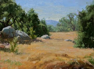
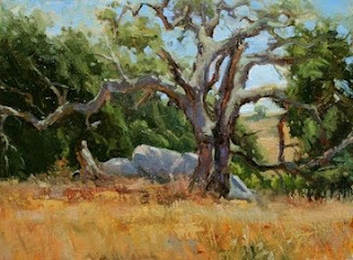
In this time of oil spills and general disregard for our environment, it was great to pay visits to some of the most wonderful natural spots around Los Angeles. Nothing is more humbling than an ancient oak or more lively and exuberant than a creek. Why is it that just taking a walk in the woods seems like the best use of time ? It has the power to wash away so much mental toxic waste. The weather has been incredible this May so I just had to go out there and enjoy it. And paint it of course.

Santa Rosa Plateau. One of my favorite spots. Threatened by tasteless development and people that think it is a city park.
Peter Strauss Ranch, in the Santa Monica mountains. Not known for water courses. This year there was enough water to fill some creeks.


A great oak in the Santa Rosa Plateau.

17 May 2010

Back on the saddle


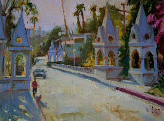
After my trip to Spain and my move to an apartment and what not, I've decided to regroup. I have started scheduling the rest of the year ( a dangerous task fraught with self-deception) and apply some of the lessons of past seasons. I signed up for Tony Pro's "Understanding the color of light workshop" of which I will post my impressions. I also intent to do larger pieces and delve a bit more into watercolor. Not to mention updating my marketing materials. Phew, I am tired already. One step at a time. I went out and forgot about it all painting this slightly overworked "Shakespeare Bridge" in Silverlake.

Show at the Los Angeles Cathedral.


The day finally arrived when my "Siegfrieds" (three of them) were hung at the Our Lady of Angels Cathedral as part of the California Art Club organized Ring Cycle exhibit. Many artists participated with interpretations of Wagner's work that ranged from the classical illustration style to the almost abstract an even humorous. Each chapel was decorated with pieces corresponding to the parts of the Opera. One last big chapel captured the paintings that had no specific episodic attribution like landscapes or symbolic artwork. The space of the cathedral is stunning to say the least and the reception was a lot of fun. Unusual subject in an unusual setting for sure.